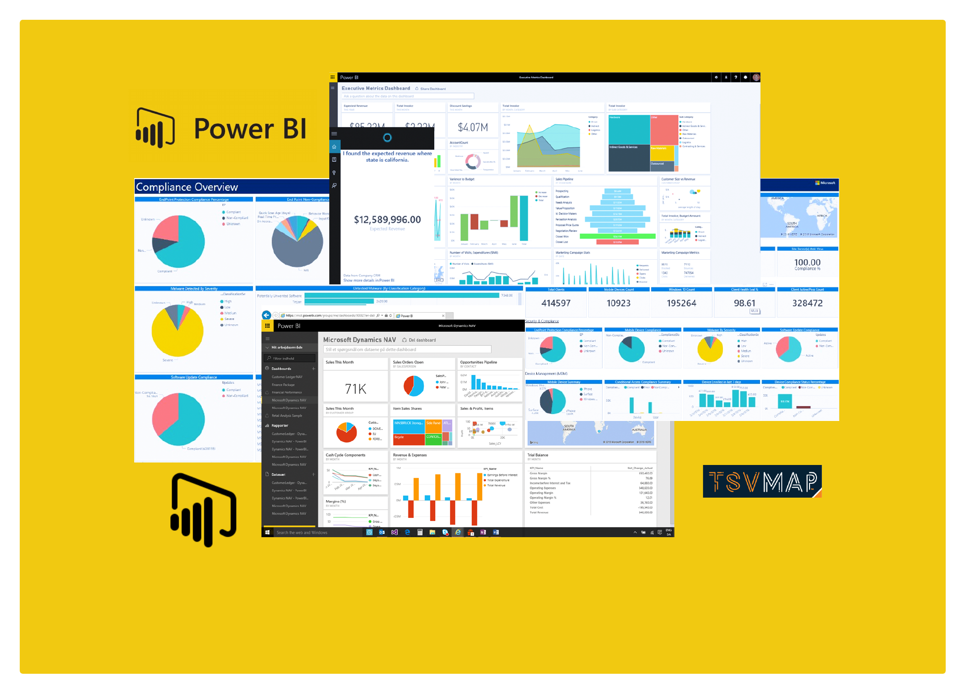
Power BI
Power BI is a powerful business analytics tool that enables organizations to visualize and analyze their data in a streamlined manner. It offers a range of features that empower users to create interactive reports and dashboards that communicate insights effectively. With Power BI, businesses can gain a competitive advantage by making data-driven decisions quickly and efficiently. Whether you’re a small business or a large enterprise, Power BI can help you make sense of your data and gain valuable insights. In this article, we’ll dive deeper into Power BI’s features and show you how you can leverage this tool to get the most out of your data.
Power BI is a robust data visualization tool that is ideal for manufacturers looking to create interactive dashboards and reports that communicate insights effectively. Here’s a step-by-step guide on how to create a data flow visualization using Power BI:
- Connect to your data source: Power BI allows you to connect to a wide range of data sources, such as Excel files, databases, or cloud services. Choose the data source that you want to use and connect to it seamlessly.
- Create a data flow: A data flow is a sequence of data transformations that cleanses and prepares your data for analysis. With Power BI, creating a data flow is a breeze. Start building your data flow by selecting “Dataflows” from the left-hand menu and clicking “Create”.
- Add data transformations: Use the data flow editor to add data transformations such as filtering, sorting, merging, and aggregating to your data. You can also create calculated columns and measures to add new fields to your data and gain insights that were previously impossible.
- Create a dataset: Once your data flow is complete, you can use it to create a dataset that you can leverage in your reports and visualizations. To create a dataset, select “Datasets” from the left-hand menu and click “Create”.
- Create a report: With the report editor, you can create visualizations such as tables, charts, and maps that are tailored to your manufacturing business’s needs. Select the fields from your dataset that you want to use in your visualizations, and drag and drop them onto the canvas.
- Customize your visualizations: Personalize your visualizations by changing the colors, fonts, and formatting to match your brand identity. Additionally, you can add interactions between your visualizations, which enables you to filter data between multiple visuals seamlessly.
- Publish your report: Share your insights with others by publishing your report to the Power BI service. Select “Publish” from the top menu, and choose the workspace where you want to publish your report.
By following these steps, you can create a data flow visualization using Power BI that delivers actionable insights to manufacturers, enabling them to make informed decisions based on their data.
 TSVMap is here to help grow your manufacturing processes and consult on your IT Solutions, that way we can make it more effective and efficient. So if you need: IT Solutions, Consultants, ERP Systems, MRP Systems, Automations, or Cyber Security. Contact us today at 864-991-5656 or Email info@tsvmap.com


0 Comments